Design details / 3 min read
A little colour. A lot of character.
Choose a custom motorcycle colour scheme by deciding what should attract attention and what should sit quietly around it. Start with one main colour, consider the metal and upholstery already on the bike, and compare physical samples before committing. A screen image is a useful reference, not a reliable final colour specification.
Choose the feeling before the shade
A colour name alone rarely describes the full idea. “Green” could mean understated, military-inspired, playful or highly polished. Add a few words about the character you want, then find references that show that character consistently.
Look beyond motorcycles if it helps. Clothing, old packaging, a favourite helmet or a piece of furniture can explain your taste without becoming a template to copy. The goal is a shared language for the project, not a folder with fifty incompatible shades.
Let the shape influence the colour
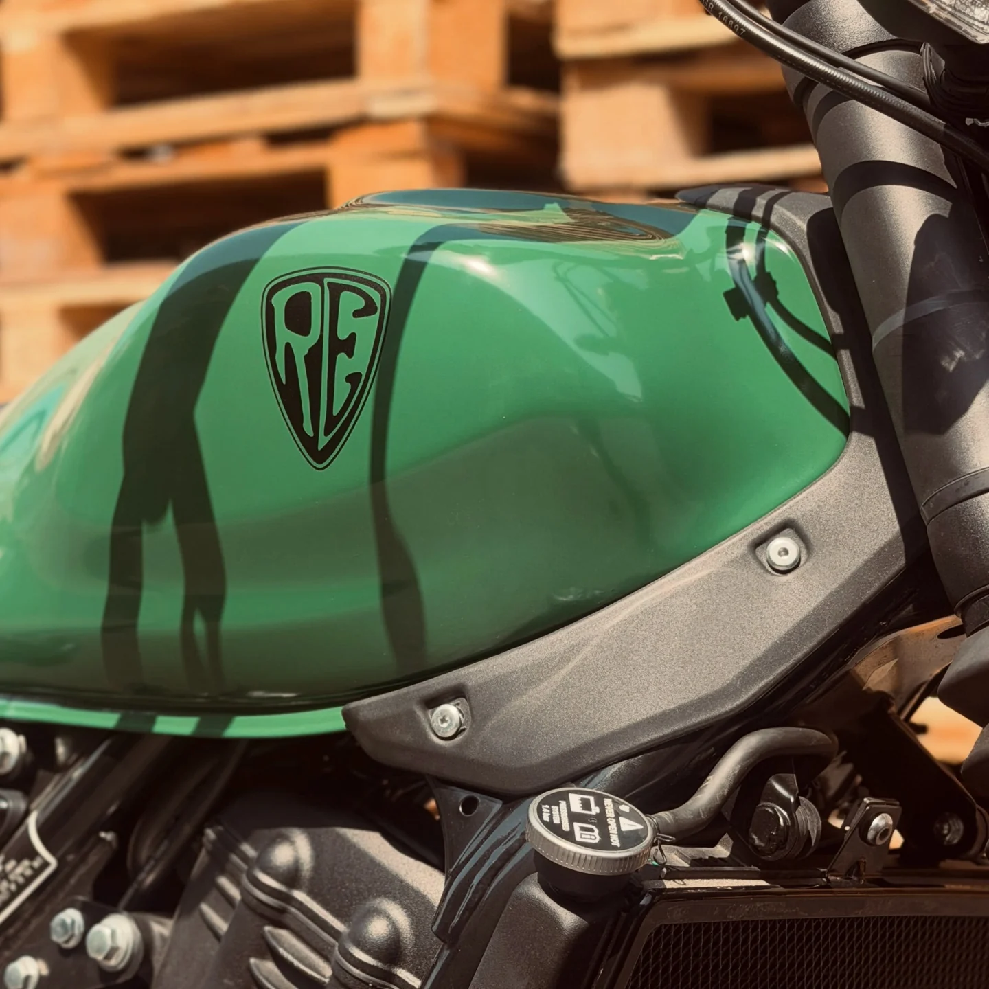
A tank is a curved surface, not a flat swatch. Its shoulders, recesses and reflections change how a colour is perceived. A scheme that looks balanced in a side-view sketch may feel different from the riding position or at the front of the bike.
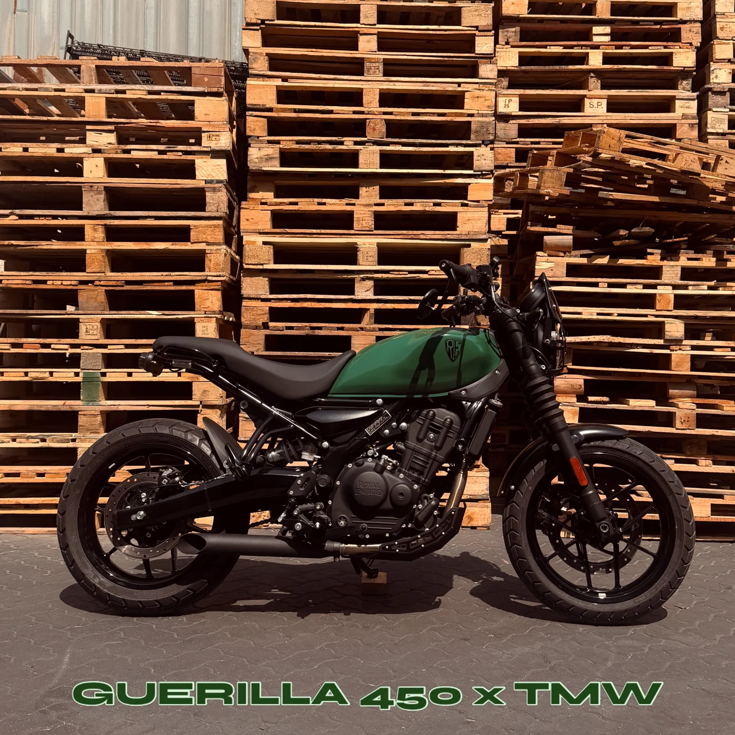
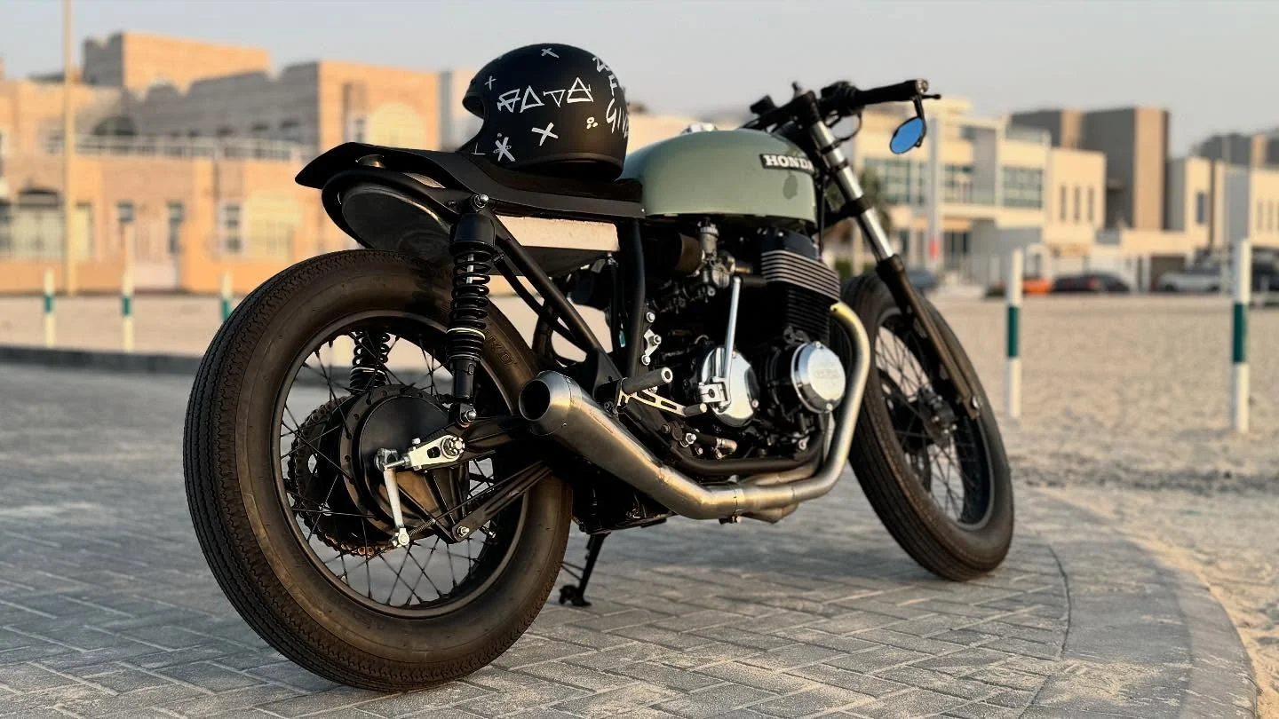
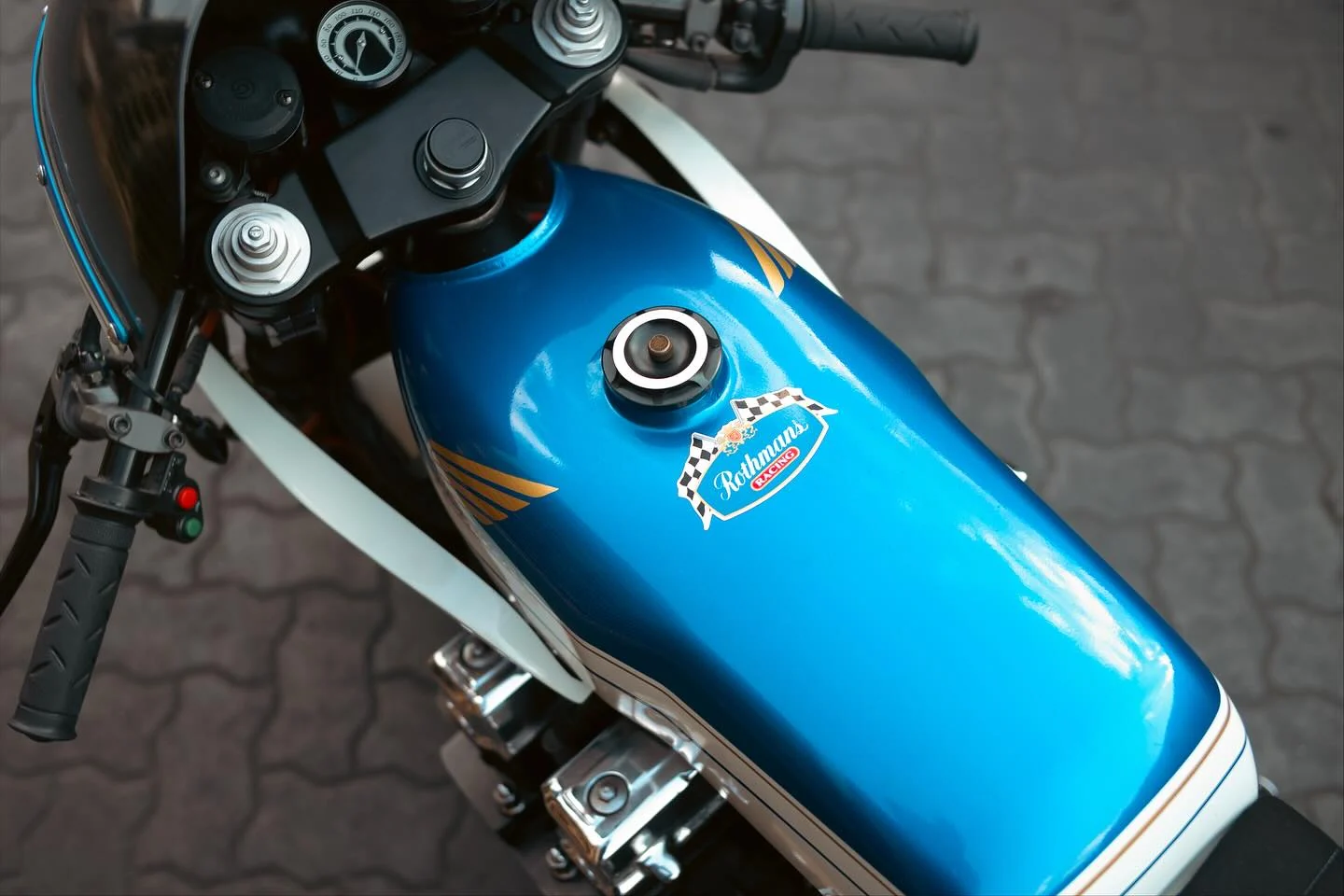
Use photographs from several angles when discussing the proposal. On Taco Moto Werx’s green Guerrilla 450, the tank is an obvious focal point against darker components. The blue-and-white CB750 tribute uses larger areas of contrasting bodywork to tell a different visual story. Both are useful examples of colour working with a shape.
Count the colours already present
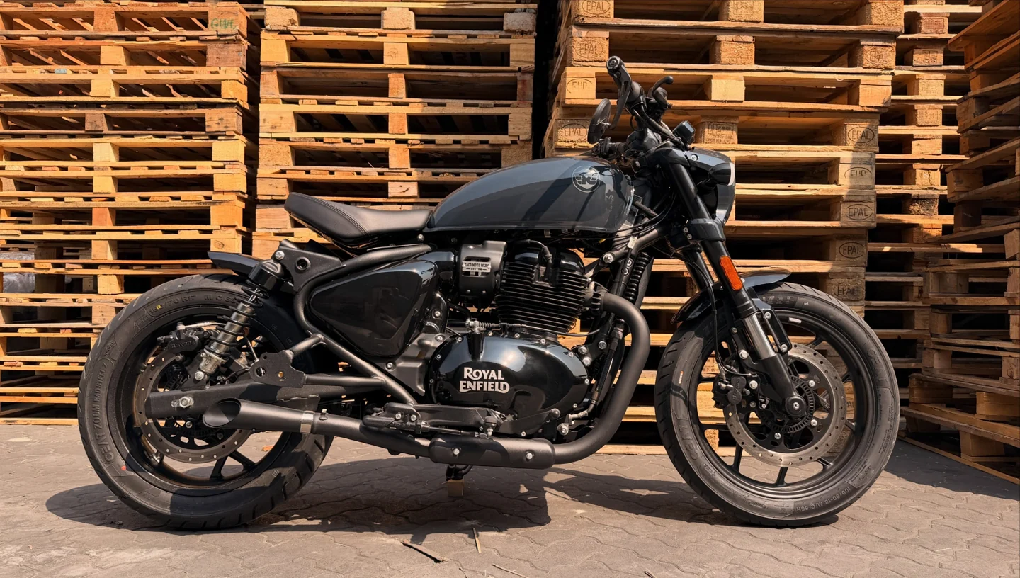
Before adding anything, look at the wheels, engine, exposed metal, seat and small fittings. They all contribute to the palette, even if nobody calls them paint colours. A warm metal finish and a cool blue panel create a different relationship from black parts and a muted olive tank.
Try making a simple list of the visible materials and tones. Then decide which will lead, which will support and which may be distracting. This makes a colour conversation more concrete than choosing a tank shade in isolation.
Use graphics with a clear purpose
A stripe can emphasise a line. A small mark can add identity. A larger graphic can become the central idea. Decide which role you want before asking several devices to compete on the same surface.
If a historic racing reference is important, explain which elements matter to you: the colour balance, the period feeling or a particular shape. Original artwork and a thoughtful interpretation can express an influence without turning the project into a copy of somebody else’s branding.
Make the final choice away from the screen
Ask to discuss physical samples, finish options and care requirements with the person responsible for the work. View a sample in more than one light where possible. A photograph can be affected by lighting, editing and your screen, so it should not be the sole basis for approving a finish.
Keep a record of the agreed colour and finish description. If the idea changes during the project, update that record before work proceeds. The point is not to remove the fun from the decision. It is to make sure everyone is imagining the same bike when the exciting part begins.
How many colours should a custom motorcycle have?
There is no fixed number. Start with a clear main colour and account for the existing metal, upholstery and components. Add further colours only when they support the overall idea.
Sources & further reading
Original editorial guidance with source notes. AI-assisted draft, awaiting human editorial review.